Next Up

Designing With Contemporary Blues

By: Amanda Lecky
August 07, 2017

Blue is the world’s favorite color for a reason: Reminiscent of sea and sky, it creates a soothing natural effect in any space. For a cool, fashion-forward look, try layering several shades of blue in the same space, as the designers of these ten gorgeous did so well.

Price and stock could change after publish date, and we may make money off these affiliate links. Learn more.
1 / 10
Photo: Eric PIasecki

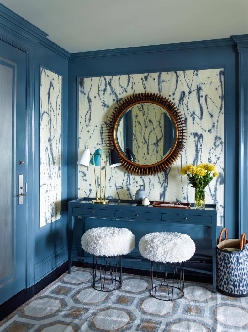
Grand Entrance

"€œBlue seems to be a color that almost everyone relates to and I can'€™t really think of a shade of blue that I don't like,"€ says designer Gideon Mendelson. "€œIn this foyer on the Upper West Side of Manhattan we painted the paneling a strong blue and inset it with a fun, painterly wall covering from Porter Toleo. The rest of the furnishings fade into the background, letting the design of the paper shine."

More photos after this Ad

2 / 10
Photo: Sarah Hebenstreit, Modern Kids

Tile Style

To update an overly chilly master bath, designer Regan Baker used cement tile—a trendy material that’s more often seen in black and white—to great effect, adding color and pattern, while preserving the home’s contemporary style. “This master bathroom was originally all white, which made it feel pretty cold, impersonal, and sterile, but it was also very contemporary,” says Baker. “The clients are fun people, and the space didn't reflect their personalities well. In addition, the bathtub got lost against a white wall, so the blue cement tile was a great way to warm up the space, and add a fun color and pattern. This tile also creates a great focal point when you walk into the room. Choosing a pop-y shade of blue keeps the room feeling modern and bright, while adding warmth to the space.”

More photos after this Ad

3 / 10
Photo: Colin Price Photography

Navy Rules

"Modern and contemporary spaces are great blank canvases for incorporating colors, including any shade of blue. I love using blues on walls in spaces with hardwood floors because the warm tones in woods contrast so well with true-blues, navies, and teals/turquoises," says designer Noz Nozawa, who put her love of blue to work in this San Francisco townhouse living room. "The home had great floors and a smart layout, but it was feeling a bit lifeless and austere on move-in, and was making the client's colorful art collection and cherished hand-carved pieces feel out of place," she says. "By painting the wall surrounding the window and glass doors navy (Benjamin Moore Hale Navy), we've framed the light sources, making the natural light feel even brighter." Adding ink-blot wallpaper on one wall and a few brighter blue accents completed the effect.

More photos after this Ad

4 / 10
Photo: Peter Murdock

Water Views, Inside and Out

"As this is a summer house with close connections to the water — bay and pool — using blues as strong accent colors was only natural," says architect Stuart Disston, who designed the house (and is also the artist of the three blue photo collages on the wood-paneled wall). The rug takes its color cues from both the door and ceiling, which is painted the color of the palest blue sky.

More photos after this Ad