Next Up

The Best White Rooms From 'HGTV Design Star'

November 25, 2014

Since season one of HGTV Design Star, contestants have been given the ultimate blank canvas. Peek through the best white rooms from past seasons as we prepare for the biggest competition yet: The White Room Challenge.

Price and stock could change after publish date, and we may make money off these affiliate links. Learn more.
1 / 30

Season 6: Clever Repurposing

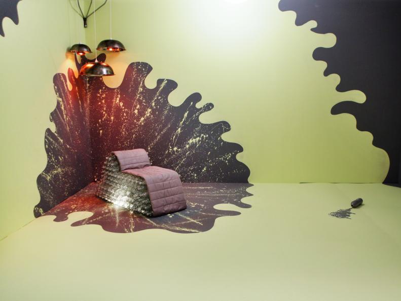
On season six's White Room Challenge, the contestants were told to design spaces that would reflect their personalities and styles as designers. In this classic Design Star challenge, the room doesn't have to be functional or livable, just creative and outside-the-box. Their source for unconventional materials? A food and restaurant supply warehouse and a budget of $1,200. The judges loved Tyler Wisler's powerful creation that actually used very few materials. The most eye-catching piece in the room — besides the wall design — is the lounge chair made of water bottles and covered with the original futon mattress. He even added a light source within the chair to illuminate the plastic bottles for an additional wow factor.

More photos after this Ad

2 / 30

Season 6: High-Flying Design

When dreaming up his white room design, Mark Diaz used his grandfather's Air Force career as inspiration. He removed all the living room components of the original white room and converted the futon into a "flying machine." The judges were impressed by his unconventional use of the futon, and his graphic mural and imaginative idea named him winner of the challenge.

More photos after this Ad

3 / 30

Season 6: Extreme Wall Covering

To create this contemporary and cohesive space, Kevin Grace ditched the kitsch and came out of the restaurant supply warehouse with some unique finds for his chic design. He created a textural and classy backdrop using butcher paper, "wallpapered" the dining table with guest checks and formed shag rugs from mop heads.

More photos after this Ad

4 / 30

Season 6: Bombs Away

Judge Vern Yip referred to Bret Ritter's design as "bunker chic" after noticing the streamlined bomb graphics on the back wall and the semi-industrial kitchen elements throughout the space. Notice the symmetry? Everything has a counterpart, which makes the space feel very simple and structured.

More photos after this Ad