Next Up

Here Are Our Favorite Colors That Go With Green

We’ve gathered gorgeous designer color palettes featuring green and share the pros’ advice on how to use them in your own space.

Price and stock could change after publish date, and we may make money off these affiliate links. Learn more.
1 / 20
Photo: Corey Szopinski

Green Can Bring Any Color Palette to Life

Verdant hues are trending and our appetite for greens just keeps growing. From barely-there sages in traditional spaces to maximalist modern jungles, there’s a green tone to complement every color scheme. Check out these color palettes and see how they interact with one another, then plant a few in your place.

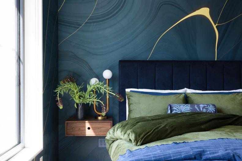
The Colors: Olive Green + Navy + Mineral Blue + Cornflower

When choosing colors to pair with green, “it really depends on your end goal and the feeling you want to create,” explains designer Amy Pigliacampo. “When the colors are similar in tone like navy and deep olive, the feeling is more calm and consistent; you can also go deep with one and light on the other, creating a more energetic and playful feeling.” The varied blues she used with green here cultivated serenity: “In the primary bedroom, we wanted the feeling to be moody, rich and enveloping, creating an energy shift from the rest of the house to this space. We wanted to keep the contrast low, focusing on texture and layering that would allow the neon pop in the wallpaper really stand out.”

see more

More photos after this Ad

2 / 20
Photo: Corey Szopinski

Red + Green That Doesn't Feel Like Christmas

The Colors: Warm Olive + Cadet Blue + Oxblood + Rose

Designer Amy Pigliacampo selected a rounded, channel-tufted headboard in a olive hue that pairs beautifully with a medium blue coverlet that carries into the modern toile print on the wall. She introduced an energetic accent with the pillows and red Verner Panton table lamp. “We kept everything a little bit more cheeky, playing off of the wallpaper motif. Here we focused on adding more contrast to the green by way of its complementary tone, red,” she explains. “We added touches of deep oxblood and pale rose to keep the palette fun and unexpected with lighter layers of wool and velvet.”

When pairing tones like these, it’s important to stray from the cliche. “Complementary colors are always an interesting space to play ... red and green can get very holiday quickly, so I like to find less expected versions of both and mix them up to create surprising combinations,” Pigliacampo says.

see more

More photos after this Ad

3 / 20
Photo: Christina Hussey

Mustard and Bronze Balance Blue-Green

The Colors: Teal + Emerald + Mustard + Lavender

Blue-ish tones, like the lavender velvet and sea green in this opulent home bar and entertainment area, can lower a room’s visual temperature. Bringing in elements like the citrine sofa and rich bronze cabinet hardware are key additions that restore the color balance. “When using green tones, it’s easy for a space to feel cold,” designer Ashley DeLapp says. “Using brass hardware and fixtures is a great way to add warmth to an otherwise cool palette.”

see more

More photos after this Ad

4 / 20
Photo: Jim Schmid

Tropical Hues Blossom Against Deep Green

The Colors: Forest Green + Peridot + Fuchsia + Lemon

In this lush main bath, “the wallpaper is Schumacher Chiang Mai Dragon in Jade and the vanity is painted in high gloss Sherwin-Williams Courtyard,” Ashley DeLapp explains. “When you use bold colors like the coral, yellow, pink, and peach in this wallpaper, it’s important to ground them with something in a deeper tone. There is a balancing act when using this much color in one area. A deeper color will recess against a paper that is this vibrant. Since you want that wallpaper to be the focal point, we are complementing it and letting it make the statement.”

see more

More photos after this Ad